Accent Bleu du Québec
Omnichannel Support
and Brand Transformation

Services
Talents on the mandate


The mandate
After analyzing the situation thoroughly, we identified several areas for improvement: Accent Bleu's brand image did not fully align with the company's potential, and its online presence required optimization, if not a complete overhaul. Our mandate thus materialized into a comprehensive 360-degree approach, addressing both B2B sales effectiveness and expanding towards more consumer-facing opportunities to develop new products and broaden their catalog. Another significant challenge was the lack of a suitable digital infrastructure to capitalize on peak sales periods online, such as Black Friday or Boxing Day. In essence, the absence of robust strategies for these transitions brought us into the picture. Our goal was to enhance Accent Bleu's visibility in numerous locations where the Quebec flag is prominently displayed, tapping into substantial business potential. This involved refining their brand strategy and transforming their online presence to better engage both B2B and B2C audiences, ensuring alignment with their organizational goals and enhancing their market reach.
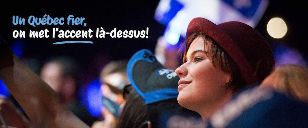
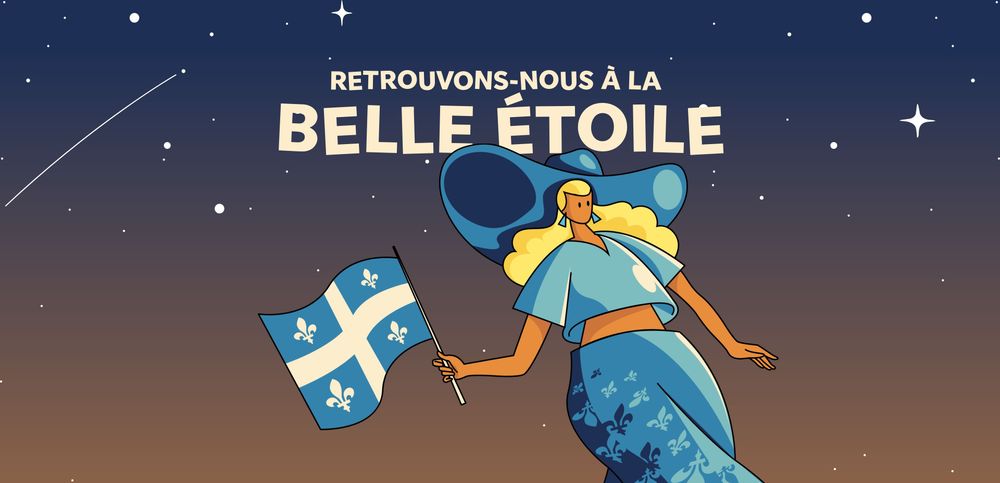
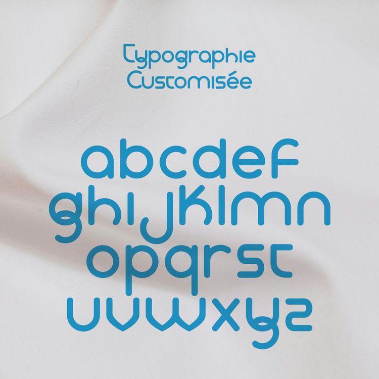
The logo was completely redesigned to reflect Accent Bleu's unique identity: a fully customized typography, including a cedilla echoing Quebec's phonetics and slang. Subtle lines were integrated to evoke the idea of a flag, a nod to patriotism, always present. The heart symbolizes attachment and love for the brand. The brand image's versatility allows us to envision its application widely, reinforcing both the visibility and attachment to the nonprofit organization, ensuring the longevity of its visual identity. This new familiar character allows us to popularize the brand's values and ideals. The slogan, on the other hand, is the element that ties everything together, conveying pride: "Un Québec fier, on met l’accent là-dessus."
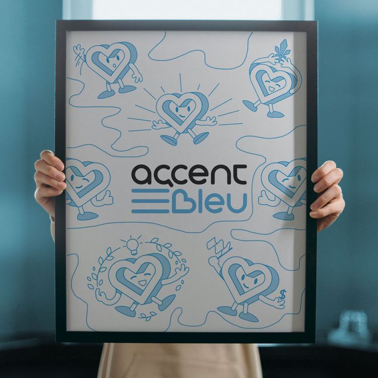
To humanize the brand, we've created a friendly character who occasionally appears to simplify messages or just to break away from the corporate mold. This character has already been instrumental in rallying support for Accent Bleu, which is crucial as the brand needs all the love it can get to evolve. We haven't named our little mascot yet, but that day will surely come!

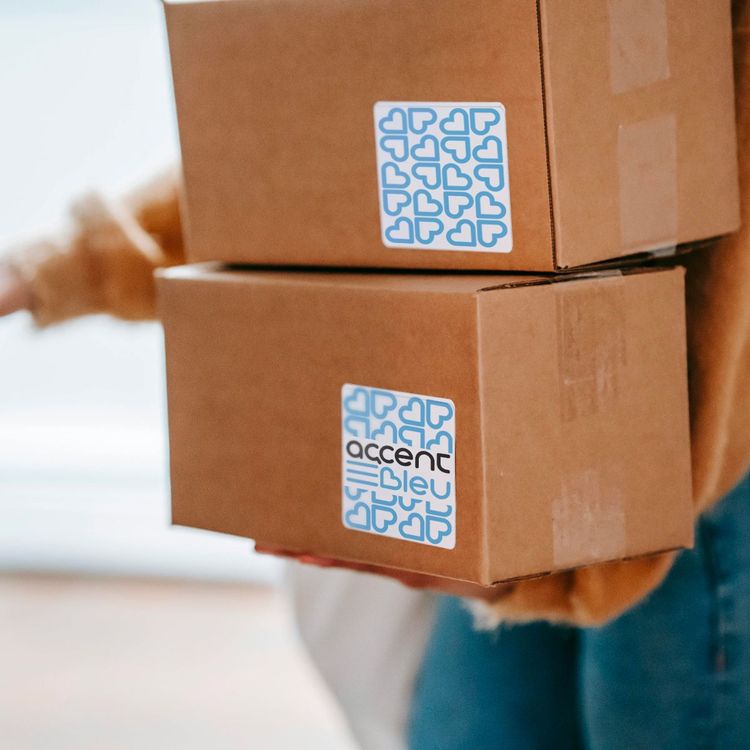
Nos diagnostics nous ont permis d’identifier qu’un changement de plateforme serait nécessaire. Nous avons donc opté pour Shopify, en choisissant un thème que nous avons entièrement personnalisé pour répondre aux besoins spécifiques du client. La gestion d'une boutique en ligne englobant à la fois des clients B2B et B2C est complexe. Il était crucial que la structure du site et les stratégies de vente permettent à ces deux entités d'acheter sans soucis, en tenant compte de leurs caractéristiques propres. Les besoins de livraison rapide pour l'une et les codes d'accès uniques pour effectuer des transactions plus grosses pour l'autre devaient être pris en compte. Nous avons donc créé un site entièrement personnalisé, avec des illustrations sur mesure pour habiller le site et exprimer la raison d'être et la mission de la marque. Pour stimuler les ventes tout en augmentant la notoriété pour Accent bleu, nous avons intégré Google Merchant. La boutique peut donc atteindre un public plus large et maximiser ses opportunités de vente en ligne.
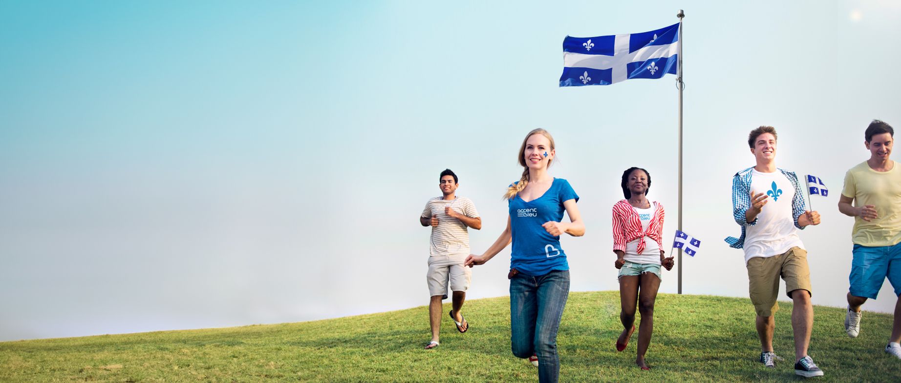
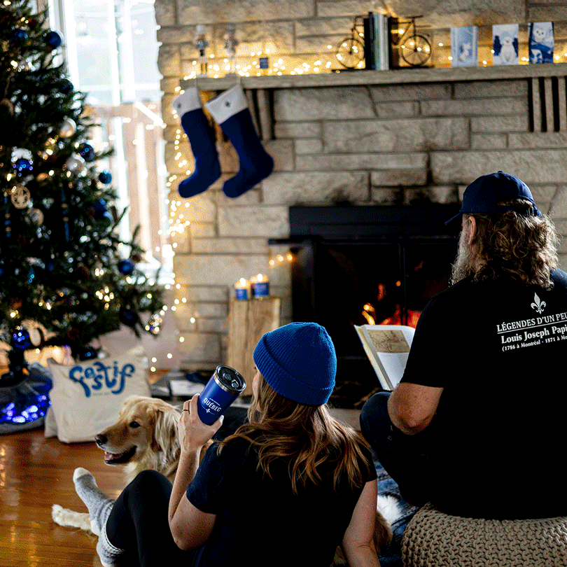
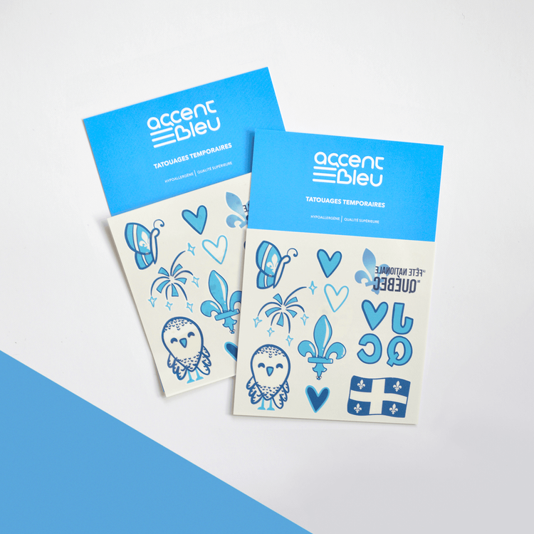
When it comes to site design, it involves image searching. Therefore, we organized several photo sessions to fill content gaps for product listings as well as advertising needs. One of the client's fundamental needs for their sales strategy was to showcase promotions during major digital shopping periods for online stores, such as Black Friday. To effectively attract this new B2C clientele, we arranged a lifestyle-focused photoshoot. Our goal was to integrate various products available on Accent Bleu's shop into everyday scenarios, within a cozy and inviting environment. The concept aimed to instill a sense of pride by offering warm home items. Our Friday wasn't black, but blue!
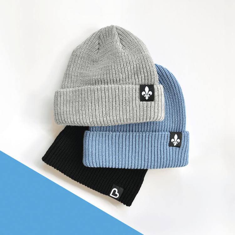
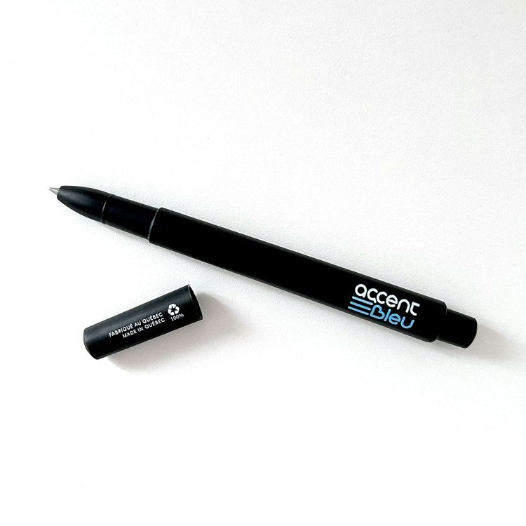
We also developed the product catalog for Accent Bleu, with a clear strategic goal that guides our decision-making process: to create high-quality products, made in Quebec, that go beyond thematic variations and seamlessly integrate into everyday life. With a head full of ideas for the brand, our primary objective remains a harmonious correlation between different collections and the long-term vision for product development. Our strategies focus increasingly on B2C, aiming to evolve the branding to reach a broader audience and maintain the brand's presence in all its facets. Thanks to our 360-degree vision and collaborative strategic involvement, Les Manifestes ensures the continuous development of the Accent Bleu brand for Quebec (much like superheroes).
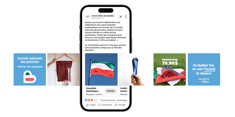
Now equipped with a new functional online store, we launched several campaigns with the primary goal of engaging audiences and meeting their preferences. We strategically chose dates with significant potential for digital sales: Black Friday for its high traffic and the National Patriots' Day for its historical significance. Our objective was to test various creatives and content to determine what resonated most with our target market. The results have been promising, with a highly engaged customer base. As part of our promotions, we offered thematic bundles for both occasions, and voila, sales have been progressing smoothly!


GOT A PROJECT
IN MIND?
Do you have a great idea and want to bring it to life? Fill out the form below with the details of your project. We would be delighted to discuss your vision and see how we can collaborate to make it happen.